Using Data Visualization to Understand Your Market
Welcome to my article about using data visualization to understand your market!
Have you ever wondered how businesses gain valuable market insights and stay ahead of the competition? Well, the answer lies in data visualization. By transforming raw numbers into visually appealing charts and graphs, data visualization offers a powerful way to analyze market trends, consumer behavior, and competitive landscapes. But how exactly can data visualization help you understand your market better? Let’s dive in and explore the world of market analysis through data visualization.
Break Free from the Lie: Most are Under Financial Stress, and it is NOT your fault. See How to Transform YOUR Financial Life!
Key Takeaways:
- Data visualization transforms raw data into visually appealing charts and graphs.
- Data visualization helps businesses unlock valuable market insights.
- Understanding market trends, consumer behavior, and the competitive landscape is crucial for staying ahead.
- Data visualization simplifies complex information and highlights key patterns.
- Leveraging data visualization techniques is essential for making informed decisions and driving business growth.
The Importance of Market Analysis
Market analysis is crucial for understanding the dynamics of a specific market. It thoroughly examines and interprets data to gain valuable insights into market trends, consumer behavior, and the competitive landscape.
This comprehensive analysis helps businesses identify opportunities, make informed decisions, and develop effective strategies. By understanding the market and its intricacies, businesses can tailor their products, pricing, and marketing efforts to meet customer demands and stay ahead of the competition.
Market analysis serves as a compass, guiding businesses to success by deeply understanding the market’s strengths, weaknesses, opportunities, and threats. With this valuable knowledge, businesses can seize opportunities, mitigate risks, and capitalize on emerging trends.
- Identify target audiences and their preferences
- Understand consumer behavior and purchasing patterns
- Evaluate the competitive landscape and identify unique selling propositions
- Assess market trends and make data-driven forecasts
- Develop effective marketing strategies
Successful market analysis empowers businesses with the knowledge and insights to navigate the ever-changing business landscape. By harnessing the power of data and analysis, businesses can steer their operations to achieve sustainable growth and maintain a competitive edge.
Traditional Approaches to Market Analysis
Regarding market analysis, businesses have long relied on traditional approaches to gain insights into their target market. These approaches include market research and surveys, competitor analysis, and SWOT analysis. Let’s take a closer look at each of these traditional market analysis approaches:
1. Market Research and Surveys
Market research and surveys are crucial in understanding consumer preferences, buying behavior, and market trends. Businesses can gather valuable insights that inform their marketing strategies and decision-making processes by collecting data from customers and potential customers.
2. Competitor Analysis
Competitor analysis examines direct and indirect competitors’ strategies, products, pricing, and market share. By studying their competitors’ strengths and weaknesses, businesses can identify opportunities to differentiate themselves and gain a competitive advantage.
3. SWOT Analysis
SWOT analysis is a strategic planning tool that assesses a company’s internal strengths and weaknesses and external opportunities and threats. By evaluating these factors, businesses can comprehensively understand their position in the market and develop strategies that leverage their strengths and mitigate their weaknesses.
While these traditional market analysis approaches provide foundational insights, businesses can enhance their effectiveness by incorporating data visualization techniques. By transforming raw numbers into visual representations, businesses can make complex data easier to understand and uncover actionable insights.
Businesses can use data visualization tools and techniques to present market research findings, competitor analysis data, and SWOT analysis results visually engagingly. Businesses can effectively communicate their analysis findings to stakeholders and make data-driven decisions by leveraging charts, graphs, and interactive dashboards.
Market Analysis Tools and Techniques
As a market analyst, you have numerous tools and techniques to analyze and visualize market data effectively. These market analysis tools and data visualization techniques can significantly enhance your decision-making process and provide valuable insights. Let’s explore some of the key tools and techniques that can help you excel in market analysis:
Data Visualization Tools
Data visualization tools are crucial in market analysis. They allow you to transform raw data into visually appealing charts, graphs, and dashboards. These tools enable you to identify trends, patterns, and relationships that might go unnoticed in traditional data formats. You can efficiently analyze large datasets and gain actionable insights by leveraging visualization tools like Tableau, Power BI, or Google Data Studio.
Effective Data Visualization Techniques
Effective data visualization techniques are essential for presenting market analysis data clearly and understandably. Choosing the appropriate technique based on the data type and analysis goals is crucial when visualizing data. For example, bar charts, line graphs, and pie charts are commonly used to represent numerical data, while maps can be used to visualize geographic data.
Furthermore, clear and understandable graphics are essential for effective data visualization. Labeling your visualizations accurately, utilizing color coding to highlight key insights, and adding annotations to provide additional context is important. Implementing these techniques allows you to create visualizations that effectively communicate your market analysis findings.
Market Analysis Dashboards
Market analysis dashboards consolidate key market data, competitor insights, and consumer behavior metrics into a single interface. They provide a comprehensive overview of market trends and enable quick, data-driven decisions. You can monitor real-time data and stay ahead of the competition by utilizing market analysis dashboards, such as those offered by marketing intelligence platforms like SEMrush, Moz, or HubSpot.
In conclusion, market analysis tools, data visualization tools, and effective data visualization techniques are essential for market analysts. By leveraging these tools and techniques, you can efficiently analyze market data, gain valuable insights, and make informed decisions for your business.
The Power of Data Visualization in Marketing
Data visualization is revolutionizing the way marketers understand and communicate complex information. Businesses can effectively convey insights, engage their audience, and make data-driven decisions by representing data visually through charts, graphs, and interactive dashboards. Let’s explore the benefits of data visualization in marketing and how it enables storytelling and communication of complex information.
Enhancing Marketing Strategies with Data Visualization
Data visualization provides marketers with a powerful tool to present data in a visually appealing and engaging manner. Rather than relying on raw numbers and spreadsheets, marketers can transform their data into compelling visuals that captivate their audience’s attention.
The benefits of data visualization in marketing are manifold. First, it simplifies complex information, making it easier for marketers and consumers to understand. Visualizing data allows marketers to break down intricate concepts, trends, and patterns, enabling them to convey their message more effectively.
Data visualization also enables storytelling in marketing. Marketers can craft compelling stories around their brands, products, or services by presenting data in a narrative format. Storytelling helps engage the audience emotionally, making the information more memorable and impactful.
Communicating Complex Information with Data Visualization
Communicating complex information can be challenging, especially when dealing with large datasets or intricate analysis. Data visualization simplifies this process by transforming complex information into clear and concise visuals.
Through data visualization, marketers can highlight key insights and trends that might go unnoticed in raw data. By presenting the data visually, marketers can draw attention to details and emphasize their importance.
Break Free from the Lie: Most are Under Financial Stress, and it is NOT your fault. See How to Transform YOUR Financial Life!
Furthermore, data visualization allows marketers to communicate with various stakeholders, including executives, clients, and customers. Visual data representations facilitate better understanding and engagement, enabling all parties to make informed decisions based on derived insights.
Data visualization is like a language that allows marketers to speak to their audience in a way that is both visually appealing and informative. It helps them tell stories, engage their audience, and ultimately drive better marketing outcomes.
In conclusion, data visualization is a powerful asset in the marketing toolkit. It empowers marketers to effectively communicate complex information, engage their audience through storytelling, and make informed decisions based on data-driven insights. By leveraging the power of data visualization in marketing, businesses can gain a competitive edge and elevate their marketing strategies to new heights.
Choosing the Right Visualization for Your Data
Different types of data require different visualization techniques. Factors to consider when choosing the right technique include the type of data, the message to be communicated, and the intended audience.
For numerical data, bar charts or line graphs may be suitable options. These visualizations allow for easy comparison between different data points, making it simple to identify trends or patterns.
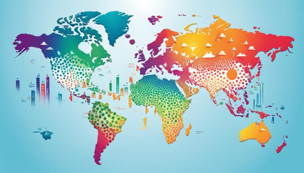
On the other hand, maps can provide a more intuitive representation of geographic data. Visualizing data on a map, you can better understand spatial relationships and identify regional patterns.
By selecting the appropriate visualization technique, you can effectively communicate your message and make your data more accessible to your audience. Whether visualizing numerical data or representing geographic information, choosing the correct visualization technique is key to effectively conveying insights and making data-driven decisions.
The Importance of Storytelling in Data Visualization
While data visualization helps present information visually, storytelling adds context and meaning to the data. By incorporating storytelling techniques into data visualization, marketers can create narratives that make the information more engaging and memorable for their audience.
Storytelling in data visualization allows marketers to simplify complex information by presenting it in a way that resonates with their audience. Instead of overwhelming viewers with raw data, storytelling helps to highlight the most important insights and key takeaways. By crafting a compelling story around the data, marketers can create a sense of urgency and motivate their audience to take action based on the insights gained.
Imagine a chart that showcases the impact of a new marketing campaign. Rather than simply presenting the data as a series of numbers and trends, storytelling in data visualization could transform it into a narrative highlighting how the campaign resulted in increased customer engagement, improved brand perception, and, ultimately, higher sales. This narrative approach makes the data more relatable and enhances its impact.
By simplifying complex information with storytelling, data visualization becomes a powerful tool for businesses across industries. Whether it’s presenting market research findings, sales performance metrics, or customer behavior trends, storytelling in data visualization allows marketers to communicate information in a way that is impactful, memorable, and easily understood by their audience.
Creating a Narrative with Data Visualization
Data visualization presents the facts, but storytelling with data visualization brings those facts to life. It’s not just about the numbers; it’s about the narrative behind them.
Through storytelling, marketers can create a clear narrative that helps their audience connect with the data more deeply. By using compelling visuals, well-crafted narratives, and a logical flow of information, marketers can guide their audience through the data and highlight the most important insights.
By creating a narrative with data visualization, marketers can simplify complex information, make it more relatable, and keep their audience engaged. Data storytelling enables marketers to present data in an easily digestible and memorable way, making it more likely that their audience will understand and remember the key messages.
The power of storytelling in data visualization lies in its ability to use narratives, characters, and personal experiences to bring the data to life. By going beyond the numbers and statistics, storytelling adds depth and emotion to the data, making it more compelling and impactful.
Simplifying Complex Information with Storytelling
Storytelling in data visualization is particularly effective in simplifying complex information. By presenting data in a narrative format, marketers can break down complex concepts and make them more accessible to their audience. They can distill the essence of the data into a compelling story that is easy to understand and relate to.
Instead of overwhelming their audience with technical jargon, complex charts, and lengthy reports, storytelling allows marketers to simplify and present information engagingly and memorably. Marketers can ensure that their audience understands the main message and is motivated to act accordingly by focusing on the key insights and telling a story around them.
Storytelling in data visualization is about creating a connection between the data and the audience. By telling a story that resonates with their audience’s experiences, challenges, and aspirations, marketers can engage their audience emotionally and make the data more meaningful and impactful.
How to Create Compelling Data Visualizations
Creating compelling data visualizations is crucial to effectively communicating your message to your audience. Follow key tips and techniques to design data visualizations that captivate and engage.
Understand Your Data
The first step in creating compelling data visualizations is thoroughly understanding the data you are working with. Analyze the dataset, identify the key insights and trends, and determine what story you want to convey through your visualization.
Choose the Right Visualization Technique
Next, select the appropriate visualization technique to represent your data best and effectively communicate your message. Choose the technique that enhances comprehension and clarity, whether it’s a bar chart, line graph, scatter plot, or any other type of visual representation.
Keep the Design Simple and Clear
Simplicity and clarity are essential elements in designing compelling data visualizations. Avoid cluttering your visualization with excessive details or unnecessary elements. Keep the design clean, ensuring that the main insights are easily understandable.
Break Free from the Lie: Most are Under Financial Stress, and it is NOT your fault. See How to Transform YOUR Financial Life!
Use Color Effectively
Color can significantly enhance the impact of your data visualizations. Choose a color palette that complements the data and effectively communicates the information. Use color strategically to highlight key insights, create visual contrast, and guide the viewer’s attention.
Craft a Story Around the Data
Tell a story around the data to make your data visualizations more engaging. Develop a narrative that connects the different elements and conveys the main message. A well-crafted story adds context and emotion, making your visualization more memorable and impactful.
Data visualization is the graphical representation of data and information. It simplifies complex concepts and communicates insights to a broad audience.
Continuously Refine Based on Audience Feedback
Finally, continuously refine your data visualizations based on audience feedback. Pay attention to how your audience interacts with your visualization and gather their insights and suggestions. Use this feedback to improve and optimize your visualizations, ensuring they effectively resonate with your audience.
By adhering to these tips and techniques, you can create data visualizations that effectively communicate your message and captivate and inspire action from your audience.
Using Data Visualization to Communicate Complex Information
Data visualization is a powerful tool that can help businesses effectively communicate complex information to their audience. When faced with large volumes of intricate data, it can be challenging for people to extract meaningful insights and understand the underlying patterns and trends. This is where data visualization comes in.
By breaking down complex data into visual elements such as charts, graphs, and diagrams, businesses can simplify information and make it more accessible to their audience. Visual representations make it easier for individuals to grasp and comprehend complex concepts and data sets.
Data visualization simplifies information and helps to highlight patterns and trends that may not be apparent in raw data. By presenting data visually, marketers can draw attention to important insights and convey their message more effectively.
For example, imagine explaining a complex market analysis to your team using only a spreadsheet filled with numbers. It may be difficult for your team members to grasp the implications and takeaways from the data fully. However, by visualizing the data using interactive charts and graphs, you can present the same information in a more engaging, informative, and memorable way.
Furthermore, data visualization enables businesses to make data-driven decisions. By transforming complex data into visual representations, decision-makers can quickly identify trends, outliers, and correlations. This allows them to make informed choices and take appropriate actions based on the insights gained from the data.
Benefits of Data Visualization for Communicating Complex Information:
- Enhanced Understanding: Individuals can better understand and interpret the data by presenting complex information visually.
- Improved Accessibility: Visual representations of data make it easier for many audiences to access and comprehend complex information.
- Effective storytelling: Data visualization helps marketers tell a compelling story around the complexities of the data, making it more engaging and memorable for their audience.
- Identifying Patterns and Trends: Visualizing complex data highlights patterns and trends that may not be immediately apparent in raw data, enabling organizations to gain valuable insights.
Overall, data visualization plays a crucial role in effectively communicating complex information. It simplifies data, makes it more accessible, and provides valuable insights to drive informed decision-making. Businesses can effectively communicate their message, engage their audience, and better use complex data by leveraging data visualization techniques.
Tips for Presenting Your Data Visualization to Your Audience
When presenting your data visualizations, there are several key tips to keep in mind to engage your audience and make a lasting impression effectively. By following these tips, you can ensure that your data visualization presentations are impactful and drive action based on the insights gained from the data.
- Know Your Audience: Before creating and presenting your data visualizations, it’s important to understand your audience and their expectations. Tailor your presentation to their level of knowledge and use language and visuals that resonate with them.
- Keep It Simple: Data visualizations should be clear and concise, avoiding clutter and unnecessary details. Simplify complex information using clean layouts, minimal colors, and clear labels to guide your audience’s understanding.
- Use Color Effectively: Color can be a powerful tool in conveying meaning and drawing attention to key insights in your data visualizations. Choose a color palette that enhances your message and ensures the essential elements stand out.
- Tell a Story: Don’t present your data visualizations as standalone charts and graphs. Instead, weave them into a compelling narrative, highlighting the insights and outcomes that are most relevant to your audience.
- Test and Refine: Before presenting your data visualizations to a broader audience, test them with a smaller group and gather feedback. Use this feedback to refine and improve your visualizations, ensuring they communicate the intended message effectively.
By incorporating these tips into your data visualization presentations, you can effectively engage your audience, capture their attention, and inspire action based on the insights gained from the data.
Data visualization is not just about making pretty pictures; it’s about using visuals to communicate complex information in a simple and engaging way.
Conclusion
In conclusion, data visualization is a powerful tool that can revolutionize market analysis and marketing efforts. Businesses can unlock valuable insights and tell compelling stories by transforming raw data into visually appealing charts and graphs. The ability to simplify complex information, highlight key patterns and trends, and engage the audience makes data visualization essential to any successful business strategy.
Key takeaways from this article include the importance of incorporating data visualization techniques in market analysis and marketing strategies. By leveraging data visualization, businesses can stay ahead of the competition by making informed decisions based on data-driven insights. Through the strategic use of visualizations, companies can effectively communicate complex information, engage their audience, and inspire action.
Break Free from the Lie: Most are Under Financial Stress, and it is NOT your fault. See How to Transform YOUR Financial Life!
Wrapping up, data visualization provides a wealth of benefits for businesses. It enhances market understanding, simplifies complex information, and allows for more impactful communication. By harnessing the power of data visualization, companies can gain a competitive edge and drive success in their market.
Thank you for reading my article “Using Data Visualization to Understand Your Market.” I hope you found it informative and helpful!
For more insights into content creation, read this article: Crafting Compelling Content: Tips for Engaging Your Audience.